Context/Earth

[[ Check out my Wordpress blog Context/Earth for environmental and energy topics tied together in a semantic web framework ]]


Friday, September 30, 2011

TOTAL Discovery Data

From Figure 1 of Laherrere's recent discovery data, he suggests a crude oil URR of 2200 GB.

The oil company Total S.A. also has an accounting of yearly discoveries. I overlaid their data with Laherrere's data in the figure below:


Total must do a bit of a different backdating because their data is consistently above Laherrere's for the majority of the years. As of about 2005, their cumulative is at 2310 GB while Laherrere is at 1930 GB.

This leads to the following asymptotic graph for cumulative oil according to the Dispersive Discovery model. In this case I assigned a URR of 2800 GB to the model, with a model value of 2450 GB as of 2005. In other words, the Total discovery data may hit an asymptote of 2800 GB, which may be a bit generous:


This is really for comparative purposes as I next plotted what Laherrere's discovery data looks like against the same model.

You can see that Laherrere's data likely won't hit that asymptote.

Discovery data for crude oil is hard to come by. Perhaps Laherrere is using 2P probabilities and Total is applying possible reserve growth so that it is >2P? Or perhaps Total is using barrels of oil equivalent (BOE) to inflate the numbers (which Shell oil does)? In the greater scheme of things, does this really matter?

The following chart is the Shock Model applied to the Total discovery data, whereby I tried to follow the historical crude oil (not All Liquids) production rates by varying the extraction rate until the year 2000, then I kept the extraction rate constant at about 3.1% of reserves. This is lower than the currently accepted 4% to 5% extraction rate from reserves.


If Total does use BOE maybe this should actually fit an All Liquids curve, in which case the extraction rates would need to get increased to match the higher levels of All Liquids production.

Bottom line is that the peak plateau might extend for a couple of years and we will have a fatter decline tail if we believe the Total numbers. If it is an All Liquids discovery model, then it is a wash. As if everyone didn't know this by now, peak oil is not about the cumulative, it is about the extractive flow rates, and this is a good example of that.

In general, the URR is incrementally getting pushed up with time. Laherrere had used 2000 GB for a crude oil URR for some time (see this curve from 2005) and now likely because of the deep water oil it is at 2200 GB.

As for going through the trouble of evaluating the Gulf Of Mexico data, that is just noise on the overall curve IMO. It's getting to the point that we have enough historical data that global predictions for crude oil are really starting to stabilize. And the Dispersive Discovery model will anticipate any future discoveries. The longer we wait, the closer all the estimates will start to converge, and any new data will have little effect on the projected asymptotic cumulative.

The following is a curve that takes the Total S.A. discovery data and extrapolates the future discoveries with a dispersive discovery model. The final discovery URR is 2700 billion barrels, which is quite a bit higher than the one Laherrere plots. This is higher because I am making the assumption that Total S.A. is including backdated NGPL and other liquids along with the crude oil. Which means I had to fit against the production data that also used these liquids.


To model the perturbations in production levels, which is necessary to accumulate the reserves properly, I used the Oil Shock Model. In the inset, you can see the changes in extraction rate that occurred over the years. The extraction rate is essentially the same as the Production/Reserve ratio. Notice that the extraction rate was steady until the 1960's at which it ramped up. It started to level off and drop down during the 1970's oil crisis and didn't really start to rise again until the 1990's. I am extrapolating the extraction rate from today to match the peak extraction rate of the 1960's by the year 2050.

This is largely a descriptive working model, which essentially reflects the data that Total S.A. is providing and then reflecting that in terms of what we are seeing in the production numbers. The current plateau could be extended if we try to extract even faster (as in Rockman's words "PO is about oil flow rate") or we can start including other types of fuels to the mix. This latter will happen if the EIA and IEA add biofuels and other sources to the yearly production.

The bottom-line is that it is hard to come up with any scenarios, based on the data that Total and IHS supplies , that can extend this plateau the way that Total suggests it will, peak to 2020. That is what is maddening about this whole business and you wonder why drivel such as what Yergin continues to pump out gets published.

Wednesday, September 28, 2011

Derivation of MaxEnt Diffusion applied to CO2 adjustment times

WHT,
Oil does not give a hoot about your math.
You are an historical illiterate and an imbecile hiding behind your self-declared genius.

The diffusion kernel resulting from solving the Fokker-Planck equation (sans drift term) is:

$$ \large C(t,x|D) = \frac{1}{\sqrt{4 \pi D t}} e^{-x^2/{4 D t}} $$

We place an impulse of concentrate at x=0 and want to watch the evolution of the concentration with time. We have an idea of a mean value for the diffusion coefficient, D, but don't know how much it varies. The remedy for that is to apply a maximum entropy estimate for the variance assuming a mean value D0.

$$ \large p_d(D) = \frac{1}{D_0} e^{-D/D_0} $$

So then we can apply this to the kernel function

$$ \large C(t,x) = \int_0^{\infty} C(t,x|D) p_d(D) dx $$

This actually comes out quite clean (see derivation in The Oil Conundrum book)

$$ \large C(t,x) = \frac{1}{2 \sqrt{D_0 t}} e^{-x/{\sqrt{D_0 t}}} $$

This gives us a result that shows a singularity at t=0 for x=0. In practice, the value of x is not precise, so that we can also place an uncertainty around the value of x.

$$ \large p_x(x) = \frac{1}{x_0} e^{-x/x_0} $$

Once again we can apply this to the concentration, marginalizing x out of the picture:

$$ \large C(t) = \int_0^{\infty} C(t|x) p_x(x) dx $$

This integral is very straightforward

$$ \large C(t) = \frac{1}{2} \frac{1}{x_0 + \sqrt{D_0 t}} $$

which is precisely the form, apart from normalization, used in fitting to the IPCC curves!

See fat-tail-impulse-response-of-co2. This is the impulse response function I used:

$$ \large [CO_2] = f(t) \otimes R(t) = f(t) \otimes \frac{1}{1+0.15\sqrt{t}} $$

So comparing the values, 0.15, is the square root reciprocal of a median diffusion time given by:

$$ \sqrt{t_0} = \frac{x_0}{\sqrt{D_0}} $$

This comes out to 44 years. However, because of the ratio, we lost the ability to figure out either the average diffusion coefficient or the average displacement though. The fat-tail comes about because 44 years is only a median, and a mean diffusion time does not exist.

The chart below is not definitionally correct, as it describes the impulse response as a residence time and not an adjustment time, but you can see how the diffusional model fits on top of the climate science simulations. It falls off rather quickly but then assumes the slow hyperbolic square root growth which matches well over many orders of magnitude. The one key difference is that the diffusional model will asymptotically go to zero, but it will take a long time, as long a geological time as it took for the original fossil fuel to form in all likelihood.


From the textbook "Introduction to Organic Geochemistry", I applied this fit using a value of 0.19 instead of 0.15 for the scaling coefficient. Every chart of the CO2 impulse response I have encountered shows excellent agreement with this very characteristic fat-tailed decline.


We can create a brilliant analogy of CO2 with coins in the transaction system.

Residence time is a coin getting freshly minted and finding out how long it circulates before it gets handed-off as change. When a different coin is exchanged, the person has lost track of its lineage but that does not matter as long as an equivalent coin takes its place. It doesn’t matter if the coin had identifying markers or not, as the excess coins are still circulating.

Adjustment time is a coin cycling through the system long enough that it gets decommissioned or gets lost or destroyed. It then permanently gets removed from the system.

The coin in the financial transaction system is equivalent to the CO2 molecule in the carbon cycle.

Now look at the relative rates of residence time of a coin versus that of the adjustment time. You will find that a typical residence time is measured in weeks, but the adjustment time is years. This is exactly the same rationale of a CO2 residence time in years and a CO2 adjustment time in centuries.

These kinds of studies have been done on circulation of money, look up the Where's George project. I was able to use this data to generate a model for travel patterns of people here. Perhaps not remarkably, this data shows the same fat-tail statistics that the CO2 does. This is all based on standard random-walk and dispersion arguments that come up time and time again.

Saturday, September 24, 2011

Fat-Tail Impulse Response of CO2

This is a combination of the last two posts. The first post called Explaining "The Missing Carbon" reviewed the fat-tail response of atmospheric CO2 adjustment time to a carbon forcing function, and detailed how the Fokker-Planck (FP) diffusion models sequestering of CO2 into deep stores. The first step is to approximate the impulse response, R(t):

$$ \large [CO_2] = f(t) \otimes R(t) = f(t) \otimes \frac{1}{1+0.15\sqrt{t}} $$

Next we convolve this impulse response with the fossil fuel estimates, f(t), from the last 260 years (data from the Carbon Dioxide Information Analysis Center at Oak Ridge National Labs)


Next we convert the carbon emissions in metric tons to a CO2 concentration in ppm, and plot it in comparison to the historically measured CO2 concentrations at Mauna Loa with the NASA GISS global temperature anomaly alongside. We choose a baseline of 290 ppm because that fits better than 280 ppm (and this is in agreement with a previous estimate made).


Now we zero in on the CO2 sensitivity so that we can compare it to the last post "The sensitivity of global temperature to CO2". The BLUE curve below shows the yearly deviations as differential CO2, short-handed as d[CO2], from the convolved impulse response, calculated since 1960. The RED curve below is yearly d[CO2] data from NOAA. The GREEN curve is data directly computed from the fossil fuel emissions, that is no impulse response convolution.


This data removes all the seasonal adjustments and though there is likely a weak correlation with measured d[CO2], most of the CO2 variation is associated with multi-year temperature fluctuations.This link http://www.skepticalscience.com/print.php?r=145 points to work by (Bacastow and Keeling 1981) and Section 7.3.2.4 of the IPCC AR4 Working Group 1 report. The latter has all the details:
[IPCC] — The atmospheric CO2 growth rate exhibits large interannual variations (see Figure 3.3, the TAR and http://lgmacweb.env.uea.ac.uk/lequere/co2/carbon_budget). The variability of fossil fuel emissions and the estimated variability in net ocean uptake are too small to account for this signal, which must be caused by year-to-year fluctuations in land-atmosphere fluxes. Over the past two decades, higher than decadal-mean CO2 growth rates occurred in 1983, 1987, 1994 to 1995, 1997 to 1998 and 2002 to 2003. During such episodes, the net uptake of anthropogenic CO2 (sum of land and ocean sinks) is temporarily weakened. Conversely, small growth rates occurred in 1981, 1992 to 1993 and 1996 to 1997, associated with enhanced uptake.
Those years do indeed match, just odd that no one ever thought to actually plot the numbers and show the cross-correlation. This seems like such obvious scientific book-keeping that I am dumb-founded by the lack of a published plot.
[IPCC] — Since the TAR, many studies have confirmed that the variability of CO2 fluxes is mostly due to land fluxes, and that tropical lands contribute strongly to this signal (Figure 7.9). A predominantly terrestrial origin of the growth rate variability can be inferred from (1) atmospheric inversions assimilating time series of CO2 concentrations from different stations (Bousquet et al., 2000; Rödenbeck et al., 2003b; Baker et al., 2006), (2) consistent relationships between δ13C and CO2 (Rayner et al., 1999), (3) ocean model simulations (e.g., Le Quéré et al., 2003; McKinley et al., 2004a) and (4) terrestrial carbon cycle and coupled model simulations (e.g., C. Jones et al., 2001; McGuire et al., 2001; Peylin et al., 2005; Zeng et al., 2005). Currently, there is no evidence for basin-scale interannual variability of the air-sea CO2 flux exceeding ±0.4 GtC yr–1, but there are large ocean regions, such as the Southern Ocean, where interannual variability has not been well observed.
Take a look at figure 7.9 in particular and one can see how the trends change quite a bit for CO2 measurements over ocean versus land. Curiously Mauna Loa is in the ocean yet it shows the strong correlation of the land stations.

In any case, the long-term atmospheric CO2 concentration is clearly explainable by a fossil-fuel forcing function. The short-term deviations in CO2 are explained by a combination of fluctuating carbon emissions along with a strong dependence on natural short-term temperature fluctuations (shown below).

with a strong cross-correlation between Temperature and the Proportional-Derivative d[CO2] model:

Monday, September 12, 2011

The sensitivity of global temperature to CO2

Doing exploratory analysis with the CO2 perturbation data at the Wood For Trees data repository and the results are very interesting. The following graph summarizes the results:


Rapid changes in CO2 levels track with global temperatures, with a variance reduction of 30% if d[CO2] derivatives are included in the model. This increase in temperature is not caused by the temperature of the introduced CO2, but is likely due to a reduced capacity for the biosphere to take-up the excess CO2.

This kind of modeling is very easy if you have any experience with engineering controls development. The model is of the type called Proportional-Derivative, and it essentially models a first-order equation
$$\Delta T = k[CO_2] + B \frac{d[CO_2]}{dt}$$

The key initial filter you have to apply is to average the Mauna Loa CO2 data over an entire year. This gets rid of the seasonal changes and the results just pop out.
The numbers I used in the fit are B=1.1 and k=0.0062. The units are months. The B coefficient is large because the CO2 impulse response has got that steep downslope which then tails off:
$$ d[CO_2] \sim \frac{1}{\sqrt{t}}$$

Is this a demonstration of causality, +CO2 => +Temperature?

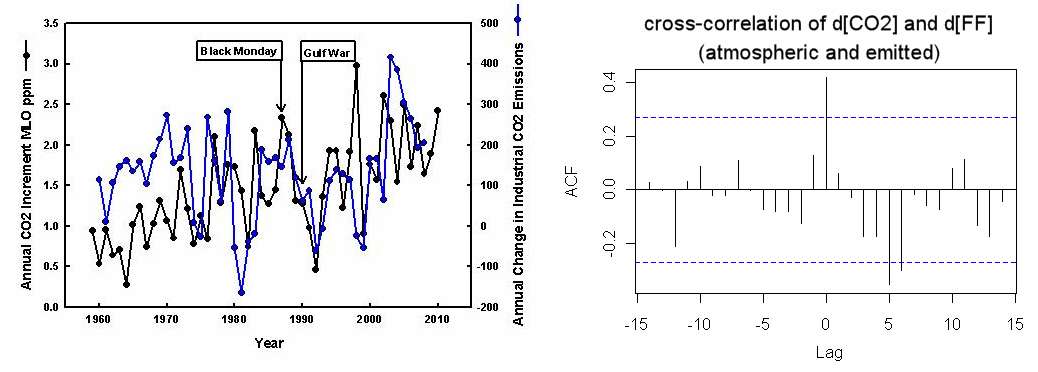
If another causal chain supports the change in CO2, then likely. We have fairly good records of fossil fuel (FF) emissions over the years. The cross-correlation of the yearly changes, d[CO2] and d[FF], show a zero-lag peak with a significant correlation (below right). The odds of this happening if the two time-series were randomized is about 1 out of 50.

Left chart from Detection of global economic fluctuations in the atmospheric co2 record. This is not as good a cross-correlation as the d[CO2] and dTemperature data -- look at year 1998 in particular, but the zero-lag correlation is clearly visible in the chart..

This is the likely causality chain:
$$d[FF] \longrightarrow d[CO_2] \longrightarrow dTemperature$$

If it was the other way, an increase in temperature would have to lead to both CO2 and carbon emission increases independently. CO2 could happen because of outgassing feedbacks (CO2 in oceans is actually increasing despite the outgassing), but I find it hard to believe that the world economy would increase FF emissions as a result of a warmer climate.

What happens if there is a temperature forcing CO2  ?

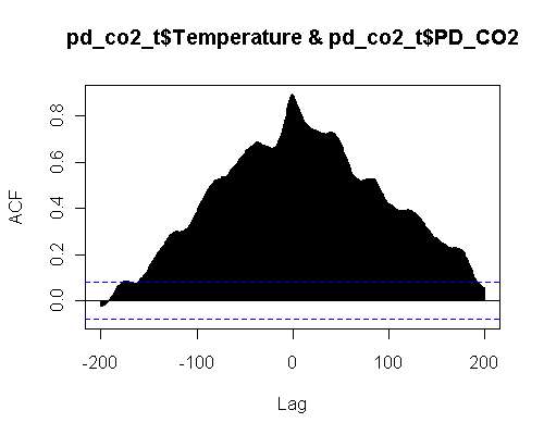
With the PD model in place the of d[CO2] against Temperature cross-correlation looks like the following:

The Fourier Transform set looks like the following:


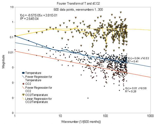
This shows the two curves have the same slope in spectrum and just a scale shift. The upper curve is the ratio between the two curves and is essentially level.

The cross-correlation has zero lag and a strong correlation of 0.9. The model again is
$$ \Delta T = k[CO_2] + B \frac{d[CO_2]}{dt}$$

The first term is a Proportional term and the second is the Derivative term. I chose the coefficients to minimize the variance between the measured Temperature data and the model for [CO2]. In engineering this is a common formulation for a family of feedback control algorithms called PID control (the I stands for integral). The question is what is controlling what.

When I was working with vacuum deposition systems we used PID controllers to control the heat of our furnaces. The difference is that in that situation, the roles are reversed, with the process variable being a temperature reading off a thermocouple and the forcing function is power supplied to a heating coil as a PID combination of T. So it is intuitive for me to immediately think that the [CO2] is the error signal, yet that gives a very strong derivative factor which essentially amplifies the effect. The only way to get a damping factor is by assuming that Temperature is the error signal and then we use a Proportional and an Integral term to model the [CO2] response. Which would then give a similar form and likely an equally good fit.

It is really a question of causality, and the controls community have a couple of terms for this. There is the aspect of Controllability and that of Observability (due to Kalman).
Controllability: In order to be able to do whatever we (Nature) want
with the given dynamic system under control input, the system must be controllable.
Observability: In order to see what is going on inside the system under observation, the system must be observable.

So it gets to the issue of two points of view:
1. The people that think that CO2 is driving the temperature changes have to assume that nature is executing a Proportional/Derivative Controller on observing the [CO2] concentration over time.
2. The people that think that temperature is driving the CO2 changes have to assume that nature is executing a Proportional/Integral Controller on observing the temperature change over time, and the CO2 is simply a side effect.

What people miss is that it can be potentially a combination of the two effects.
Nothing says that we can’t model something more sophisticated like this:
$$ c \Delta T + M \int {\Delta T}dt = k[CO_2] + B \frac{d[CO_2]}{dt}$$

The Laplace transfer function Temperature/CO2 for this is:
$$ \frac {s(k + B s)}{c s + M} $$

Because of the s in the numerator, the derivative is still dominating but the other terms can modulate the effect.


This blog post did the analysis a while ago, the image below is fascinating because the overlay between the dCO2 and Temperature anomaly matches to the point that the noise even looks similar .  This doesn't go back to 1960.


If CO2 does follow Temperature, due to the Causius-Clapeyron and the Arrhenius rate law, a positive feedback will occur -- as the released CO2 will provide more GHG which will then potentially increase temperature further. It is a matter of quantifying the effect. It may be subtle or it may be strong.

From the best cross-correlation fit, the perturbation is either around (1) 3.5 ppm change per degree change in a year or (2) 0.3 degree change per ppm change in a year.

(1) makes sense as a Temperature forcing effect as the magnitude doesn’t seem too outrageous and would work as a perturbation playing a minor effect on the 100 ppm change in CO2 that we have observed in the last 100 years.
(2) seems very strong in the other direction as a CO2 forcing effect. You can understand this if we simply made a 100 ppm change in CO2, then we would see a 30 degree change in temperature, which is pretty ridiculous, unless this is a real quick transient effect as the CO2 quickly disperses to generate less of a GHG effect.

Perhaps this explains why the dCO2 versus Temperature data has been largely ignored. Even though the evidence is pretty compelling, it really doesn’t further the argument on either side. On the one side interpretation #1 is pretty small and on the other side interpretation #2 is too large, so #1 may be operational.

One thing I do think this helps with is providing a good proxy for differential temperature measurements. There is a baseline increase of Temperature (and of CO2), and accurate dCO2 measurements can predict at least some of the changes we will see beyond this baseline.

Also, and this is far out, but if #2 is indeed operational, it may give credence to the theory that that we may be seeing the modulation of global temperatures the last 10 years because of a plateauing in oil production. We will no longer see huge excursions in fossil fuel use as it gets too valuable to squander, and so the big transient temperature changes from the baseline no longer occur. That is just a working hypothesis.

I still think that understanding the dCO2 against Temperature will aid in making sense of what is going on. As a piece in the jigsaw puzzle it seems very important although it manifests itself only as a second order effect on the overall trend in temperature. In summary, as a feedback term for Temperature driving CO2 this is pretty small but if we flip it and say it is 3.3 degrees change for every ppm change of CO2 in a month, it looks very significant. I think that order of magnitude effect more than anything else is what is troubling.

One more plot of the alignment. For this one, the periodic portion of the d[CO2] was removed by incorporating a sine wave with an extra harmonic and averaging that with a kernel function for the period. This is the Fourier analysis with t=time starting from the beginning of the year.
$$ 2.78 \cos(2 \pi t - \theta_1) + 0.8 \cos(4 \pi t - \theta_2) $$
$$ \theta_1 = 2 $$
$$ \theta_2 = -0.56 $$
phase shift in radians. The yearly kernel function is calculated from this awk function:
BEGIN {
  I=0
}
{
  n[I++] = $1
}
END {
  Groups = int(I / 12)
  ## Kernel function
  for(i=0; i<=12; i++) {
    x = 0
    for(j=0; j<Groups; j++) {
      x += n[j*12+i]
    }
    G[i] = x/Groups
  }
  Scale = (G[12]-G[0])
  for(i=0; i<=12; i++) {
    Y[i] = (G[i]-G[0]) -i*Scale/12
  }

  for(j=0; j<Groups; j++) {
    for(i=0; i<12; i++) {
      Diff = n[j*12+i] - Y[i]
      print Diff
    }
  }
}

This was then filtered with a 12 month moving average. It looks about the same as the original one from Wood For Trees, with the naive filter applied at the source, and it has the same shape for the cross-correlation. Here it is in any case; I think the fine structure is a bit more apparent(the data near the end points is noisy because I applied the moving average correctly).


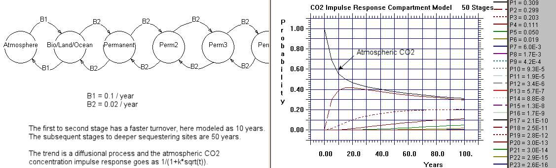
How can the derivative of CO2 track the temperature so closely? My working theory assumes that new CO2 is the forcing function. An impulse of CO2 enters the atmosphere and it creates an impulse response function over time. Let's say the impulse response is a damped exponential and the atmospheric temperature responds quickly to this profile.

The CO2 measured at the Mauna Loa station takes some time to disperse over from the original source points. This implies that a smearing function would describe that dispersion, and we can model that as a convolution. The simplest convolution is an exponential with an exponential, as we just need to get the shape right. But what the convolution does is eliminate the strong early impulse response, and thus create a lagged response. As you can see from the Alpha plot below, the way we get the strong impulse back is to take the derivative. What this does is bring the CO2 signal above the sample-and-hold characteristic caused by the fat-tail. The lag disappears and the temperature anomaly now tracks the d[CO2] impulses.

If we believe that CO2 is a forcing function for Temperature, then this behavior must happen as well; the only question is whether the effect is strong enough to be observable.

If you realize that the noisy data below is what we started with, and we had to extract a non-seasonal signal from the green curve, one realizes that detecting that subtle a shift in magnitude is certainly possible.

Sunday, September 11, 2011

Explaining the "Missing Carbon"

Certain laws of physics can't be denied and the model of the carbon cycle is really set in stone. The fundamental law is one of mass balance and every physicist worth his salt is familiar with the master equation, also known as the Fokker-Planck formulation in its continuous form.
What we are really interested in is the detailed mass balance of carbon between the
atmosphere and the earth's surface. The surface can be either land or water, it doesn't matter for argument's sake.

We know that the carbon-cycle between the atmosphere and the biota is relatively fast and the majority of the exchange has a turnover of just a few years. Yet, what we are really interested in is the deep exchange of the carbon with slow-releasing stores. This process is described by diffusion and that is where we can use the Fokker-Planck to represent the flow of CO2.

This part can't be debated because this is the way that the flow of all particles works; they call it the master equation because it invokes the laws of probability and in particular the basic random walk that just about every physical phenomenon displays.

The origin of the master model is best described by considering a flow graph and
drawing edges between compartments of the system. This is often referred to as a
compartment or box model. The flows go both ways and are random, and thus model the random walk between compartments.
The following chart is a Markov model consisting of 50 stages of deeper sequestering with each slab having a constant but small hop rate. The single interface between the atmosphere and the earth has a faster hopping rate corresponding to faster carbon cycling.


That shows how you would solve the system numerically. The basic analytical
solution to the Fokker-Planck assuming a planar source and one-dimensional diffusion is the following:
$$ \frac1{\sqrt{2 \pi t}} exp(-x^2/{2t}) $$

Consider that x=0 near the surface, or at the atmosphere/earth interface.
Because of that, this expression can be approximated by
$$ n(t)=\frac{q}{\sqrt{t}} $$
where n(t) is the concentration evolution over time and q is a scaling factor for
that concentration.
First thing one notices about this expression is that n(t) has a fat tail and
after a rapid initial fall-off only slowly decreases over time. The physical meaning is that, due to diffusion, the concentration randomly walks between the interface and deeper locations in the earth. The square root of time dependence is a classic trait of all random walks and you can't escape seeing this if you have ever watched nature in action. That is just the way particles move around.

For CO2 concentration this in fact describes the evolution of the adjustment
time, and it accurately reflects the infamous IPCC curve for the atmospheric CO2 impulse response. It is called an impulse response because that is the response that one would expect based on an initial impulse of CO2 concentration.

But that is just the first part of the story. As an impulse response, n(t) describes what is called a single point source of initial concentration and its slow evolution. In practice, fossil-fuel emissions generate a continuous stream of CO2 impulses. These have to be incorporated somehow. The way this is done is by the mathematical technique called convolution.

So consider that the incoming stream of new CO2 from fossil fuel emissions is
called F(t). This becomes the forcing function.
Then the system evolution is described by the equation
$$ c(t)=n(t)*F(t) $$
where the operator * is not a multiplication but signifies convolution.

Again, there is no debate over the fundamental correctness of what has been said
so far. This is exactly the way a system will respond.

If we are now to put this into practice and see how well it describes the actual
evolution of CO2, we can understand ever nagging issue that has haunted skeptical observers. It really all becomes very clear.

For the forcing function F(t) we use a growing power law.
$$ F(t) = k t^N $$
where N is the power and k is a scaling constant.

This roughly represents the atmospheric emissions through the industrial era if
we use a power law of N=4. See the following curve:


So all we really want to solve is the convolution of n(t) with F(t). By using
Laplace transforms on the convolution expression, the answer comes out
surprisingly clean and concise. Ignoring the scaling factor :
$$ c(t) \sim t^{N+1/2} $$

With that solved, we can now answer the issue of where the "missing" CO2 went
to. This is an elementary problem of integrating the forcing function, F(t), over time and then comparing the concentration, c(t), to this value. Then this ratio of c(t) to the integral of F(t) is the amount of CO2 that remains in the atmosphere.
Working out the details, this ratio is:
$$ q \sqrt{\frac{\pi}{t}}\frac{(N+1)!}{(N+0.5)!} $$
Plugging in numbers for this expression, q=1, and N=4, then the ratio is about 0.
28 after 200 years of growth. This means that 0.72 of the CO2 is going back into
the deep-stores of the carbon cycle, and 0.28 is remaining in the atmosphere.
If we choose a value of q=2, then 0.56 remains in the atmosphere and 0.44 goes
into the deep store. This ratio is essentially related to the effective
diffusion coefficient
of the carbon going into the deep store.

Come up with a good number for the diffusion coefficient and we have an explanation of the evolution of the "missing carbon".

BTW, This is useful for modifying the numbers.
alpha equation


Alexander Harvey comment
R(t,0) = α/Sqrt(t) where α can be derived from the diffusivity and thermal capacity.

The general case R(t,λ) is not easily stated but can be calculated by the deconvolution of R(t,0) with the unit impulse fucntion to which an impulse term 1/λ at t=0 is added and the whole is deconvoluted with the unit impulse function. This is I think the same as can be achieved using the Laplace transforms in the continuous case.

This comment is the closest to my own thinking on the topic. The 1/Sqrt(t) profile is likely the explanation for the "fat-tail" in the residence cum adjustment time that the IPCC has been publishing. Consider this (EVALUATING THE SOCIAL COSTS OF GREENHOUSE GAS)
To represent this carbon cycle, Maier-Reimer and Hasselmann (1987) have suggested that the carbon stock be represented as a series of five boxes, each with a constant, but different atmospheric lifetime. That is, each box is modelled as in equation (7), and atmospheric concentration is a weighted sum of all five boxes. Maier-Reimer and Hasselmann suggested lifetimes of 1.9 years, 17.3 years, 73.6 years, 362.9 years and infinity, to which they attach weights of 0.1, 0.25, 0.32, 0.2 and 0.13, respectively
I punched these numbers in and this is what it looks like in comparison to a disordered diffusion profile:


The boxes they talk about simply describes a model of maximum entropy disorder. If the maximum entropy disorder is governed by force (i.e. drift), the profile will go toward 1/(1+t/a) and if it is governed by diffusion (i.e. random walk) it will go as 1/(1+sqrt(t/a)). Selecting a weighted sum of exponential lifetimes is exactly the same as choosing a maximum entropy distribution of rates, and I believe that whatever their underlying simulation is that it will asymptotically trend toward this result. The lifetime they choose for infinity is needed because otherwise the fat-tail will eventually disappear.

This is the MaxEnt derivation
integral exp(-1/(x*t))*exp(-x)/sqrt(x*t)*dx from x=0 to x=infinity