$$ c = c_0 * e^{-E/kT}$$
and the climate sensitivity is
$$ T = \alpha * ln(c/c_1) $$
where c is the mean concentration of CO2, then it seems that one could estimate a quasi-equilibrium for the planet’s temperature. Even though they look nasty, these two equations actually solve to a quadratic equation, and one real non-negative value of T will drop out if the coefficients are reasonable.
$$T = \alpha * ln(c/c_1) - \alpha * E / kT $$
For CO2 in fresh water, the activation energy is about 0.23 electron volts. From "Global sea–air CO2 flux basedon climatological surface ocean pCO2, and seasonal biological and temperature effects" by Taro Takahashi,
The pCO2 in surface ocean waters doubles for every 16C temperature increaseThis gives 0.354 eV.
(d ln pCO2/ dT=0.0423 C ).
We don’t know what c1 or c0 are and we can use estimates of climate sensitivity for α is (between 1.5/ln(2) and 4.5/ln(2)).
When solving the quadratic the two exponential coefficients can be combined as
$$ ln(w)=ln(c_0/c_1)$$
then the quasi-equilibrium temperature is approximated by this expansion of the quadratic equation.
$$ T = \alpha ln(w) – \frac{E}{k*ln(w)} $$
What the term “w” means is the ratio of CO2 in bulk to that which can effect sensitivity as a GHG.
As a graphical solution of the quadratic consider the following figure. The positive feedback of warming is given by the shallow-sloped violet curve, while the climate sensitivity is given by the strongly exponentially increasing curve. Where the two curves intersect, not enough outgassed CO2 is being produced such that the asymptotically saturated GHG can further act on. The positive feedback essentially has "hit a rail" due to the diminishing return of GHG heat retention.

We can use the Vostok ice core data to map out the rail-to-rail variations. The red curves are rails for the temperature response of CO2 outgassing, given +/- 5% of a nominal coefficient, using the activation energy of 0.354 eV. The green curves are rails for climate sensitivity curves for small variations in α.

This may be an interesting way to look at the problem in the absence of CO2 forcing. The points outside of the slanted parallelogram box are possibly hysteresis terms causes by latencies of in either CO2 sequestering or heat retention. On the upper rail, the concentration drops below the expected value, while as drops to the lower rail, the concentration remains high for awhile.
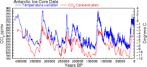

The cross-correlation of Vostok CO2 with Temperature:

Temperature : ftp://ftp.ncdc.noaa.gov/pub/data/paleo/icecore/antarctica/vostok/deutnat.txt
CO2 core : ftp://ftp.ncdc.noaa.gov/pub/data/paleo/icecore/antarctica/vostok/co2nat.txt
The CO2 data is in approximately 1500 year intervals while the Temperature data is decimated more finely. The ordering of the data is backwards from the current date so the small lead that CO2 shows in the above graph is actually a small lag when the direction of time is considered.
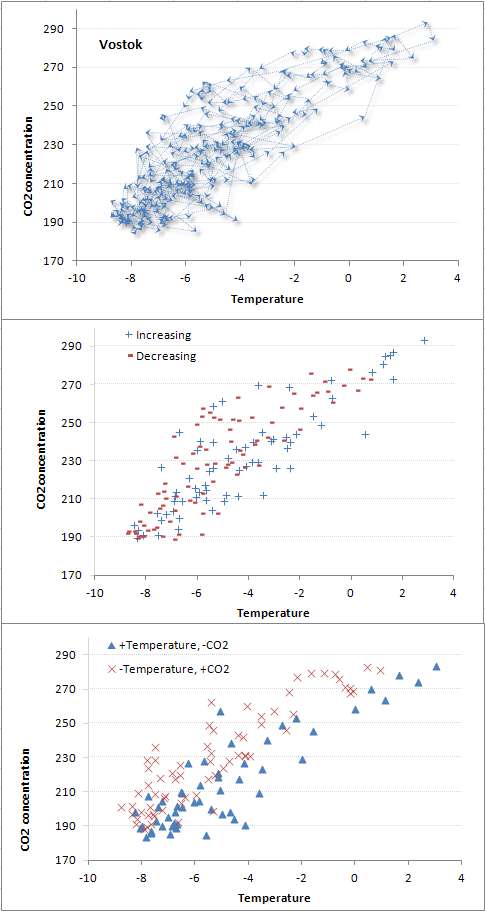
The top chart shows the direction of the CO2:Temperature movements. Lots of noise but a lagged chart will show hints of lissajous figures, which are somewhat noticeable as CCW rotations for a lag. On temperature increase, more of the CO2 is low than high, as you can see it occupying the bottom half of the top curve.
The middle chart shows where both CO2 and T are heading in the same direction. The lower half is more sparsely populated because temperature shoots up more sharply than it cools down.
The bottom chart shows where the CO2 and Temperature are out-of-phase. Again T leads CO2 based on the number you see on the high edge versus the low edge. The lissajous CCW rotations are more obvious as well.
Bottom line is that Temperature will likely lead CO2 because I can’t think of any Paleo events that will spontaneously create 10 to 100 PPM of CO2 quickly, yet Temperature forcings likely occur. Once set in motion, the huge adjustment time of CO2 and the positive feedback outgassing from the oceans will allow it to hit the climate sensitivity rail on the top.
So what is the big deal? We don’t have a historical forcing of CO2 to compare with, yet we have one today that is 100 PPM.
That people is a significant event, and whether it is important or mot we can rely on the models to help.
This is what the changes in temperature look like over different intervals.

The changes follow the MaxEnt estimator of a double sided damped exponential. A 0.2 degree C change per decade(2 degree C per century) is very rare as you can see from the cumulative.

That curve that runs through the cumulative density function (CDF) data is a maximum entropy estimate. The following constraint generated the double-sided exponential or Laplace probability density function (PDF) shown below the cumulative:
$$\int_{I}{|x| p(x)\ dx}=w$$
which when variationally optimized gives
$$p(x)={\beta\over 2}e^{-\beta|x|},\ x\ \in I=(-\infty,\infty)$$
where I fit it to:
$$\beta = 1/0.27$$
which gives a half-width of about +/- 0.27 degrees C.
The Berkeley Earth temperature study shows this kind of dispersion in the spatially separated stations.

Another way to look at the Vostok data is as a random up and down walk of temperature changes. These will occasionally reach high and low excursions corresponding to the interglacial extremes. The following is a Monte Carlo simulation of steps corresponding to 0.0004 deg^2/year.

The trend goes as:
$$ \Delta T \sim \sqrt{Dt}$$
Under maximum entropy this retains its shape:

This can be mapped out with the actual data via a Detrended Fluctuation Analysis.
$$ F(L) = [\frac{1}{L}\sum_{j = 1}^L ( Y_j - aj - b)^2]^{\frac{1}{2}} $$
No trend in this data so the a coefficient was set to 0. This essentially takes all the pairs of points, similar to an autocorrelation function but it shows the Fickian spread in the random walk excursions as opposed to a probability of maintaining the same value.
The intervals are a century apart. Clearly it shows a random walk behavior as the square root fit goes though the data until it hits the long-range correlations.

Very good analysis that clearly points out that Progressives do not use science since not one comment in about 5 years. This may prove Progressives cannot read science and must always added the statement 'scientist say" to anything they spout off.
ReplyDelete