Context/Earth

[[ Check out my Wordpress blog Context/Earth for environmental and energy topics tied together in a semantic web framework ]]


Thursday, February 7, 2013

The Luke Oilers

In the climate science world, those who side with consensus science and agree that anthropogenic global warming is real are at a minimum referred to as "lukewarmers".
These people may not be as rabid as the true-believers, yet they don't dismiss the scientific theory and evidence as do the so-called "climate deniers".

I ran across a similar type of minimal acceptance, though very muted and disguised, when I participated in a blog comment discussion at Climate Etc.  The top-level post concerned Maugeri's wrong-headed analysis and conclusion of near-cornucopian oil availability.

In the ensuing discussion, it was clear that the climate skeptics, who would otherwise not admit that Peak Oil was real, would nevertheless continue to push  alternatives such as nuclear and unconventional oil, and suggest that BAU could continue.  This contradiction pointed to the fact that they implicitly agree in the Peak Oil concept while denying that the progressives and technocrats (such as Hubbert) were correct in their overall assessment.

I suggest these implicit Peak Oil believers need to be referred to as "luke-oilers", distinct from the explicit Peak Oilers.  To be a luke-oiler, all it takes for you is to admit that the Bakken or the Tar Sands or nuclear will meet our future energy needs. Its actually not that high a bar that you have to clear to be a luke-oiler, but it wasn't high for a lukewarmer either -- just an admission to the facts on the the ground. The earth is warming due to man, and the oil is depleting due to man.

---

At the cross-roads of peak oil and climate science we see a world of dogs and cats, living together. On occasion this gets stirred up as in this Slate opinion piece by noted climate scientist and atmospheric physicist Raymond T. Pierrehumbert. The title is 'The Myth of “Saudi America”: Straight talk from geologists about our new era of oil abundance.'
In this piece Pierrehumbert discusses the issue of Bakken oil and acknowledges Rune Likvern's analysis of Red Queen behavior in shale oil.  At the end, he suggests a kind of "No Regrets" policy in that we move rapidly toward alternatives to oil, using the oil that we have right now to solve both the predicaments of oil depletion and AGW.


Saturday, January 19, 2013

Deleted comment

I responded indirectly to a post http://earlywarn.blogspot.co.nz/2013/01/bakken-well-stats.html and Bakken data as a comment on The Oil Drum. The comment showed up and then disappeared.

It was still in my cache when I discovered it was deleted, and reproduced here (click to enlarge)

This was nothing new, but a rephrasing of analysis work from last year: http://theoilconundrum.blogspot.com/2012/05/bakken-growth.html

Both Rockman's and my comment was apparently deleted, with no reason why.  I have learned that one can't complain publicly about why a comment would get deleted on The Oil Drum, as that is grounds for a temporary banishment from posting any further comments.

But I can complain all I want here because this is my space. It sucks because I spend time doing the analysis and then it goes into a black hole.

BTW, Stuart Staniford does not seem to add anything as an analyst. He is no Kevin Drum,
who wrote this piece.  Interesting that one can use the convolution algorithms of the oil shock model to model the crime rate variation as it follows the gasoline lead content over the last century. Crime rate tracks the convolution of lead content over time with a delay function describing a distribution of adult maturation times (peaking around 20 years of age). I bet Drum is right in the correlation and cause.

From http://www.sciencedirect.com/science/article/pii/S0160412012000566


Tuesday, January 15, 2013

Field Guide to Climate Clowns

The climate science blog known as Climate Etc is essentially infested with cranks, crackpots, and wackos, each with their own pet theory on why the consensus AGW science is wrong or an alternate view is preferred over the basic greenhouse-gas-based physics.

As someone mentioned, crackpot theories on global warming are almost fractal in nature -- in other words, wrong on almost every scale that you can interpret them.

I compiled the following "Field Guide" in response to my experiences commenting at that site.  The most unusual statistical anomaly concerns the relative abundance of crackpots from Down Under, who also seem to be the most rabid, a trait that one might trace to the Oz tradition of mocking authority, known as Larrikinism.

Whatever compelled me to keep track of these clowns (who are vaguely similar to the fossil fuel cornucopians on oil depletion blogs) I hope it provides some levity.

I want to add that that I have largely stopped commenting at Climate Etc because the editorial policies of the blog site's owner do not allow singling out of crackpots, but instead allow the crackpots themselves free reign (and the blog's proprietor never engages with the crackpot theorists themselves, therefore essentially condoning the pseudo-scientific ideas. Kind of counter-effective to advancing science, in my opinion).
curryja | January 16, 2013 at 5:42 am "Very large number of comments (approaching 10% of total CE comments) plus too many insults. I will take you off moderation if you can calm down the insults. Also, anyone that mentioned ‘BBD’ in their comment also went into moderation, so I could assess both sides of these exchanges."
The commenter BBD happens to be the most sensible commenter on the site. No wonder the site is such a magnet for Why People Believe Weird Things. It's not quite as bad and one-sided as the infamously insane "Best Scientific Blog" WUWT, but that's not saying much.

Edit:
This bit explains everything, and essentially provides a rationale for why my documentation of these climate clowns is needed.
It has nothing to do with their research and their views. I tolerate what I view to be scientific crackpottery. I tolerate people talking about Nazis and commies. I do not tolerate one person saying the same thing over again. I do not tolerate insults to other commenters.
 Why would anyone, let alone a scientist, tolerate scientific crackpottery? 

I don't tolerate it, and given the fact that I have no control over scientific discourse at most levels, my choice is to document the atrocities. 

Don't read the comments! Online communities shape risk perception
More people get science news from blogs, where commentary shapes opinions.

How Blog Comments, Google Autocomplete Reinforce Scientific Bias
A new journal article claims that blog comments and Google autocomplete influence the public on new scientific research.

Climate Etc does not help the situation  by condoning crackpot commentary. It gets indexed by Google just like everything else.
Someone recommended to try to avoid the filter bubble. Let's try out the filter-free https://duckduckgo.com/
 
wind "maximum entropy"
"dispersive transport"
"oil shock" model
"hyperbolic decline"

CO2 diffusion "adjustment time"
 
For each of these search phrases, which are kind of obscure but not that odd, the top hit goes to either my mobjectivist blog or this blog.


Saturday, September 29, 2012

Bakken approaching diffusion-limited kinetics

From Great Bear Petro (image recovered 5/2/2013)


What is interesting in that GreatBear graphic is the progression of the permeability of the reservoirs. The permeability is going down by an order of magnitude for each new technology introduced. I don't understand all the intricacies of geology but I do understand the mathematics and physics of diffusion. See here.

What decreasing permeability means is that the production rates of oil are now becoming completely diffusion-limited. In other words, the flow of oil is essentially a random walk from the source to the destination. All these new technologies are doing is exploiting the capabilities of diffusion-limited capture. This is the bottom-of-the-barrel stuff, kind of like driving your car off of fumes, or keeping your maple syrup bottle upside down, to make a more intuitive analogy out of it. The Bakken rates are likely all diffusion limited and I will be willing to bet this based on some of the data from Mason.

James Mason 2012 paper

From Mason's data, the flow of oil out of a hydraulically fractured well appears to be controlled by diffusional dynamics. This is what an average Bakken well decline looks like if one uses Mason's charts.


The cumulative is the important part of the curve I believe because he plotted the instantaneous production incorrectly (which I tried to correct with the black dots).

But then if we look at Brackett's analysis of Bakken (see below), I can better fit the average well to a hyperbolic decline model. A hyperbolic decline is an ensemble average of exponential declines of different rates, assuming maximum entropy in the distribution in rates (this works to describe lots of physical phenomena).


That conflicts with the diffusional model that better describes Mason's data.

Now, I believe it's possible that Brackett simply took the 1/e decline point on each well and then tried to extrapolate that to an average production. That's the easy way out and is definitely wrong as this will always approximate a hyerbolic decline; of course I can check this if I can get access to the 3,694 samples that Brackett says goes into his analysis.

Mason and Brackett can't both be right, as there are sufficient differences between diffusional flow decline and hyperbolic decline to impact projections. The former is steeper at first but has a fatter tail, whereas the latter will definitely decline more in the long term. Brackett says the average well will generate 250,000 barrels of oil while Mason shows twice that and still increasing.

Rune Likvern has a lot of the data that he painstakingly scraped from PDF files.
Likvern 1 | Likvern 2 (in Swedish)


There will be more data forthcoming in the next few years. We will see how it pans out.

Monday, September 17, 2012

Lake ice-out dates earlier and earlier ...

With all the interest in the Arctic sea-ice extent reaching new minimums in area and volume, it seems instructive to point out a similar phenomena occurring in habitable areas.

Let's take the situation of Minnesota lakes and track the "ice-out" calendar dates.  The premise is that if the earth is warming, the ice-out dates should occur earlier and earlier in the season. A similar situation occurs for "first-ice" later in the season, but the "ice-out" date occurs very abruptly on a given day, and therefore has less uncertainty.

The time of ice-out actually occurs so suddenly on a typical lake that it takes patient observation skills to wait it out. If one is not paying attention, the ice breaks up and within a few hours it's completely melted and gone. But this abruptness is useful in terms of precision, as the timing is certain to within a day for a given lake.

Minnesota is a good test-case because it has many lakes and a hard freeze is guaranteed to occur every winter.

For this reason, "ice-out" records have a combination of qualitative knowledge and calibrated precision. The qualitative knowledge lies in the fact that it takes only one observer who knows how to read a calendar and record the date. The precision lies in the fact that the ice-out date is unambiguous, unlike other historical knowledge [1]. Since ice-out is also a natural integral averaging technique, the dates have a built-in filter associated with it and the measure is less susceptible to single-day extremes; in other words, real ice-out conditions require a number of warm days.

The data can be collected from the Minnesota DNR web site. As presented, the data has been processed and expressed in a user-friendly geo-spatial graphic showing the ice-out dates for a sampling of lakes of a given year. First, I pulled out an animated GIF below (see Figure 1 ).  If you look closely one can see a noisy drift of the tan/red/orange/yellow colors corresponding to March and early April moving northward.

Figure 1 : Animated GIF of ice-out dates in Minnesota.


Fortunately, underneath the graphics is a server that generates the processed data from a JSON-formatted data stream. By directly reading from the JSON and processing, we can come up with the linear regression plots for various geographic latitudes as shown in Figure 2. The "ice-out" day on the vertical axis is given by the number of days since the first of the year. Trying not to be too pedantic, but the lower this number, the earlier the ice-out day occurs in the year.

This essentially pulls the underlying data out of the noise and natural fluctuations. Note the trend toward earlier ice-out dates with year, and of course, a later-in-the-season ice-out day with increasing latitude. Interesting as well is the observation that greater variance in the ice-out date occurs in recent years -- in other words, the highs and lows show more extremes [2].
Figure 2: Ice-out dates for lakes of a given latitude occur earlier in the season
according to a linear regression model.

In the inset below is  logic code for retrieving and analyzing the ice-out dates from the Minnesota DNR site.  The call-out to rplot interfaces to an R package linear model plot and curve fit. My processing is two-step, first a call to get_all_records, which stores the data in memory, then a call to lat_list which retrieves the ice-out dates for a given latitude. As an example, all lake latitudes for 45N are between 45N and 46N degrees.
minnesota_dnr_ice_out('http://www.dnr.state.mn.us/services/climatology/ice_out_by_year.html?year=').

:- dynamic
    temperature/6.

assert_temperature(Name, Lat, Year, Month, Date, Days) :-
    not(temperature(Name, Lat, Year, Month, Date, Days)),
    asserta(temperature(Name, Lat, Year, Month, Date, Days)),
    !.
assert_temperature(_,_,_,_,_,_).

store_record(Term) :-
    Term=json(
             [ice_out_first_year=_IceOutFirstYear,
              ice_out_last_year=_IceOutLastYear,
              lat=Lat,
              name=Name,
              ice_out_earliest=_IceOutEarliest,
              ice_out_latest=_IceOutLatest,
              ice_out_date=IceOutDate,
              sentinel_lake=_SentinelLake,
              ice_out_number_of_entries=_IceOutNumberOfEntries,
              id=_Id,
              lon=_Lon,
              ice_out_median_since_1950=_IceOutMedianSince1950]
             ),
    atomic_list_concat([Year,Month,Date], '-', IceOutDate),
    parse_time(IceOutDate, Stamp),
    atom_concat(Year, '-01-01', YearStart),
    parse_time(YearStart, Stamp0),
    Days is (Stamp-Stamp0)/24/60/60,
    print([Name, Lat, Year, Month, Date, Days]), nl,
    assert_temperature(Name, Lat, Year, Month, Date, Days).

get_ice_out(Year) :-
    minnesota_dnr_ice_out(URL),
    atom_concat(URL, Year, U),
    http_client:http_get(U, R, []),
    atom_json_term(R, J, []),
    J=json([status='OK', results=L, message='']),
    maplist(store_record,L).

temperature_lat(Lat_Range,Year,Time) :-
    temperature(_Name,Lat,Y,_Month,_Day,Time),
    atom_number(Lat, Lat_N),
    L is floor(Lat_N),
    Lat_Range = L,
    atom_number(Y, Year).

lat_list(Lat, Years, Times, N) :-
    findall(Y, temperature_lat(Lat,Y,T), Years),
    findall(T, temperature_lat(Lat,Y,T), Times),
    format(atom(Title), '"Minnesota Latitude = ~D North"', [Lat]),
    rplot(Years,Times,Title, '"year"', '"iceOutDay"'),
    length(Years,N).


get_all_records(From, To) :-
    findall(Year, between(From, To, Year), List),
    maplist(get_ice_out, List).

According to the data, ice-out dates have gotten earlier by about a week since 1950 (and assume that via symmetry the first-ice could be a week later on average). The table below shows the slope on a per year basis, so that -0.1 would be an average 0.1 day per year earlier ice-out. Note that the slope has increased more rapidly since 1950.

LatitudeSlope since
1843
Slope since
1950
43N-0.080-0.19
44N-0.056-0.16
45N-0.099-0.15
46N-0.040-0.078
47N-0.090-0.13
48N-0.22-0.29
49N-0.25-0.25
slope in fractional days/year

The smallest decrease occurs in the center of the state where Mille Lacs Lake is located. No urban heat island effect is apparent, with a state-wide average of -0.138 days/year since 1950.

Besides this direct climate evidence, we also see more ambiguous and circumstantial evidence for warmer winters across the state -- for example we regularly see opossum in central Minnesota, which was very rare in the past.  Something is definitely changing with our climate; this last winter had a very early ice-out, showing a record for the northern part of the state.

References

[1] See the ramblings of Tony Brown, who claims qualitative data from such ambiguous sources such as interpretations of medieval and Renaissance paintings of landscapes.
[2] See J.Hansen on the New Climate Dice, and the NASA site http://www.nasa.gov/topics/earth/features/warming-links.html


Wednesday, July 4, 2012

The Bakken Dispersive Diffusion Oil Production Model


This post continues from Bakken Growth.

The Model
Intuition holds that oil production from a typical Bakken well is driven by diffusion.  The premise is that a volume of trapped oil diffuses outward along the fractures.  After the initial fracturing, oil close by the collection point will quickly diffuse through the new paths. This does not last long, however, as this oil is then replenished by oil from further away and since it takes longer to diffuse, the flow becomes correspondingly reduced. Eventually, the oil flow is based entirely on diffusing oil from the furthest points in the effective volume influenced by the original fractured zone. This shows the classic law of diminishing returns, characteristic of Fickian diffusion.

This class of problems is very straightforward to model.  The bookkeeping is that the diffusing oil has to travel various distances to reach the collection point. One integrates all of these paths and gets the production profile. I call it dispersive because the diffusion coefficient is actually smeared around a value.

One can start from the master diffusion equation, also known as the Fokker-Planck equation.
$$ \frac{\partial f(x,t)}{\partial t} = \frac{D_0}{2} \frac{\partial^2 f(x,t)}{\partial x^2} $$

Consider that a plane of oil will diffuse outward from a depth at position x. The symmetric kernel solution is given by:
$$  f(x,t) = {1\over{2\sqrt{D_0 t}}}e^{-x/\sqrt{D_0 t}} $$
If we assume that the diffusion coefficient is smeared around the value D0 with maximum entropy uncertainty, integrate from all reasonable distances from the collection point, the cumulative solution becomes

$$ P(t) =  \frac{P_0}{1+ \frac{1}{\sqrt{D t}}} $$

The reasonable distances are defined as a mean distance from the collection point and with a distribution around the mean with maximum entropy uncertainty. P0 is the effective asymptotic volume of oil collected and the diffusion coefficient turns into a spatially dimensionless effective value D. The details of the derivation are found in the text The Oil Conundrum and is what I refer to as a general dispersive growth solution; in this case the dispersive growth follows a fundamental Fickian diffusive behavior proportional to the square root of time.  This is all very basic statistical mechanics applied to a macroscopic phenomena, and the only fancy moves are in simplifying the representation through the use of maximum entropy quantification.
 

Some Data and a Model Fit
More recent data on oil production is available from an article Oil Production Potential of the North Dakota Bakken  in the Oil&Gas Journal written by James Mason.

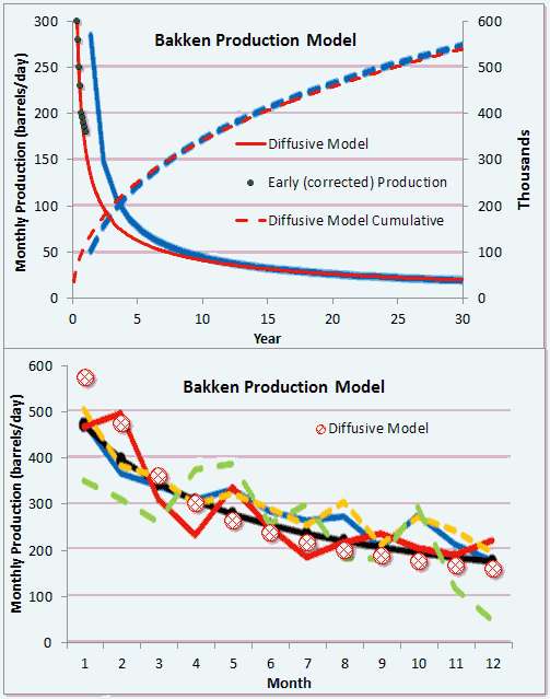
Figure 1 below shows the averaged monthly production values from Bakken compiled by Mason. The first panel shows in blue his yearly production and his cumulative. I also plotted the dispersive diffusion model in red with two parameters, an effective diffusion coefficient and an equivalent scaled swept oil volume. Note that the model is shifted to the left compared to the blue line, indicating that the fit may be bad. But after staring at this for awhile, I discovered that Mason did not transcribe his early year numbers correctly. The panel on the bottom is the production data for the first 12 months and I moved those over as black markers on the first panel, which greatly improved the fit. The dashed cumulative is the verification as the diffusive model fits very well over the entire range.

Figure 1: Model adapted to Mason Bakken Data. Top is yearly and bottom is monthly data.

For this model, the asymptotic cumulative is set to 2.6 million barrels. This is a deceptive number since the fat-tail is largely responsible for reaching this value asymptotically. In other words, we would have to wait for an infinite amount of time to collect all the diffused oil -- such is the nature of a random walk. Even to collect 800K barrels will take 100 years from extrapolating the curve. After 30 years, the data says 550K barrels, so one can see that another 70 years will lead to only 250K barrels, should the well not get shut-in for other reasons.

If these numbers that Mason has produced are high quality, and that is a big if (considering how he screwed up the most important chart) this may become a de facto physical model describing oil production for fractured wells. I can guarantee that you won't find a better fit than this considering it is only two parameters, essentially describing a rate and a volume. This is likely the actual physical mechanism as diffusional laws are as universal as entropy and the second law.

The connection to the previous post is that the substantial production increase is simply a result of gold-rush dynamics and the acceleration of the number of new wells. Wait until these new starts stop accelerating. All the declines will start to take into effect, as one can see from the steep decline in the dispersive diffusion profiles.  We may still get returns from these wells for many years, but like the 5 barrel/day stripper wells that dot the landscape in Texas and California, they don't amount to much more than a hill of beans.  The peak oil problem has transformed into a flow problem, and unless thousands of new wells are added so that we can transiently pull from the initial production spike or to continuously pull from the lower diminishing returns, this is what Bakken has in store -- a few states with thousands and thousands of wells cranking away, providing only a fraction of the oil that we demand to keep the economy running.

If someone comes up with a way to increase diffusion, it might help increase flow, but diffusion is a sticky problem. That is what nature has laid out for us, and we may have gotten as far as we can by applying hydraulic-fracturing to lubricate the diffusion paths.

This analysis fits in perfectly with the mathematical analysis laid out in The Oil Conundrum book, and will likely get added in the next edition.


Friday, May 11, 2012

Bakken Growth

Here is the cornucopian mystery of the Bakken shale revealed. When one looks at the production of the Bakken fields, the growth seems remarkable (plotted against data from the North Dakota Dept.of Mineral Resources).
Fig 1: Bakken growth, see Fig. 3 for historical
The number of wells producing is growing at an exponential rate while the amount of oil per well is remaining high. How does that work? The total amount produced during a boom period is the convolution of the well number growth rate, N(t), and the depletion rate per well, p(t). The first term is exponentially increasing and the decline rate is exponentially decreasing, see the following chart for the latter.
Fig 2: Average decline rate
Assume that all the wells are the average decline rate for the sake of condensing the argument. $$P_T(t) = \int_0^t N(\tau) p(t-\tau) d\tau \\\\ N(t) = e^{a t} \\\\ p(t) = e^{-d t} \\\\ P_T(t) = \frac{e^{a t} - e^{-d t}}{a+d} $$ If the growth is exponential with a greater than zero, then that term will easily dominate over the declining term. Divide P(t) by N(t) and you can see that we have reached the plateau of production proportional to 1/(a+d), which you can see in the figure above. That is full bore acceleration in the number of wells coming on-line. If the growth slows to zero, then the decline kicks in and the cumulative total will start to saturate. So don't be fooled by exponential growth in well production, since as soon as the construction rate starts to slow, all of those Bakken wells will start to decline and the underlying dynamics will begin to reveal itself. That is the math story behind Gold Rush dynamics and the boom-bust cycle. Everyone gets excited because they can't see the underlying behavior.

There has been continuous extraction on the Bakken going back 50+ years to 1953.  But only with the recent boom, with hydraulic fracturing techniques, are we seeing the explosion in number of wells. The prior wells were all in serious decline I believe.

This is my plea: What we need from the Dept. of Mineral Resources of NoDak.gov is a complete set of data from every well, not the rolled up info. Even with the rolled up info, you can do some decent analysis, but why not get everything?

Fig 3 : Historical Bakken growth, first well to the left was in 1953.

For an exponential and hyperbolic decline analysis on this per county data set and note they are fairly similar in decline.
  • McKenzie has a half-life of 0.75 years
  • Williams is 1.2 years
  • Mountrail is 2.3 years
  • Dunn is 18.5 years
If they are hyperbolic declines, the total will be bigger. Dunn seems to be the only set that has any kind of sustain.


Summary of Bakken
Info Since 1/1/2007


Incremental


BOPD Wells Recovery Rec/Well Well Age Curr Ave


months BOPD


Mountrail 154,089 1,087 154,727,270 142,343 22 141.8
McKenzie 96,750 533 45,059,945 84,540 9 181.5
Dunn  75,560 613 52,446,391 85,557 22 123.3
Williams 69,513 472 30,550,213 64,725 10 147.3


Major Cos 395,911 2,705 282,783,819


Total 483,706 3,187.00 327,866,294 102,876.15 17.00 141.50


Here is a link to an Wolfram Alpha solver for exponential decline, the numbers are taken from the table above for Williams county. (The number 30 is the average days in a month, as the calculation assumes a daily production rate)

Fig. 4 : Wolfram Alpha algorithm for predicting decline rate from Rec/Well=64725, WellAge=10,CurrAveBOPD=147.3

For hyperbolic decline, example using McKenzie, rates are in per day.