From
Great Bear Petro (image recovered 5/2/2013)
What is interesting in that GreatBear graphic is the progression of the permeability of the reservoirs.
The permeability is going down by an order of magnitude for each new technology introduced.
I don't understand all the intricacies of geology but I do understand the mathematics and physics of diffusion. See here.
What decreasing permeability means is that the production rates of oil are now becoming completely diffusion-limited. In other words, the flow of oil is essentially a random walk from the source to the destination. All these new technologies are doing is exploiting the capabilities of diffusion-limited capture. This is the bottom-of-the-barrel stuff, kind of like driving your car off of fumes, or keeping your maple syrup bottle upside down, to make a more intuitive analogy out of it.
The Bakken rates are likely all diffusion limited and I will be willing to bet this based on some of the data from Mason.
James Mason 2012 paper
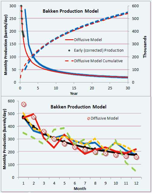
From Mason's data, the flow of oil out of a hydraulically fractured well appears to be controlled by diffusional dynamics.
This is what an average Bakken well decline looks like if one uses Mason's charts.
The cumulative is the important part of the curve I believe because he plotted the instantaneous production incorrectly (which I tried to correct with the black dots).
But then if we look at Brackett's analysis of Bakken (see below), I can better fit the average well to a hyperbolic decline model. A hyperbolic decline is an ensemble average of exponential declines of different rates, assuming maximum entropy in the distribution in rates (this works to describe lots of physical phenomena).
That conflicts with the diffusional model that better describes Mason's data.
Now, I believe it's possible that Brackett simply took the 1/e decline point on each well and then tried to extrapolate that to an average production. That's the easy way out and is definitely wrong as this will always approximate a hyerbolic decline; of course I can check this if I can get access to the 3,694 samples that Brackett says goes into his analysis.
Mason and Brackett can't both be right, as there are sufficient differences between diffusional flow decline and hyperbolic decline to impact projections. The former is steeper at first but has a fatter tail, whereas the latter will definitely decline more in the long term. Brackett says the average well will generate 250,000 barrels of oil while Mason shows twice that and still increasing.
Rune Likvern has a lot of the data that he painstakingly scraped from PDF files.
Likvern 1 | Likvern 2 (in Swedish)
There will be more data forthcoming in the next few years. We will see how it pans out.
Context/Earth
[[ Check out my Wordpress blog Context/Earth for environmental and energy topics tied together in a semantic web framework ]]
Saturday, September 29, 2012
Monday, September 17, 2012
Lake ice-out dates earlier and earlier ...
With all the interest in the Arctic sea-ice extent reaching new minimums in area and volume, it seems instructive to point out a similar phenomena occurring in habitable areas.
Let's take the situation of Minnesota lakes and track the "ice-out" calendar dates. The premise is that if the earth is warming, the ice-out dates should occur earlier and earlier in the season. A similar situation occurs for "first-ice" later in the season, but the "ice-out" date occurs very abruptly on a given day, and therefore has less uncertainty.
The time of ice-out actually occurs so suddenly on a typical lake that it takes patient observation skills to wait it out. If one is not paying attention, the ice breaks up and within a few hours it's completely melted and gone. But this abruptness is useful in terms of precision, as the timing is certain to within a day for a given lake.
Minnesota is a good test-case because it has many lakes and a hard freeze is guaranteed to occur every winter.
For this reason, "ice-out" records have a combination of qualitative knowledge and calibrated precision. The qualitative knowledge lies in the fact that it takes only one observer who knows how to read a calendar and record the date. The precision lies in the fact that the ice-out date is unambiguous, unlike other historical knowledge [1]. Since ice-out is also a natural integral averaging technique, the dates have a built-in filter associated with it and the measure is less susceptible to single-day extremes; in other words, real ice-out conditions require a number of warm days.
The data can be collected from the Minnesota DNR web site. As presented, the data has been processed and expressed in a user-friendly geo-spatial graphic showing the ice-out dates for a sampling of lakes of a given year. First, I pulled out an animated GIF below (see Figure 1 ). If you look closely one can see a noisy drift of the tan/red/orange/yellow colors corresponding to March and early April moving northward.
Fortunately, underneath the graphics is a server that generates the processed data from a JSON-formatted data stream. By directly reading from the JSON and processing, we can come up with the linear regression plots for various geographic latitudes as shown in Figure 2. The "ice-out" day on the vertical axis is given by the number of days since the first of the year. Trying not to be too pedantic, but the lower this number, the earlier the ice-out day occurs in the year.
This essentially pulls the underlying data out of the noise and natural fluctuations. Note the trend toward earlier ice-out dates with year, and of course, a later-in-the-season ice-out day with increasing latitude. Interesting as well is the observation that greater variance in the ice-out date occurs in recent years -- in other words, the highs and lows show more extremes [2].
In the inset below is logic code for retrieving and analyzing the ice-out dates from the Minnesota DNR site. The call-out to rplot interfaces to an R package linear model plot and curve fit. My processing is two-step, first a call to get_all_records, which stores the data in memory, then a call to lat_list which retrieves the ice-out dates for a given latitude. As an example, all lake latitudes for 45N are between 45N and 46N degrees.
According to the data, ice-out dates have gotten earlier by about a week since 1950 (and assume that via symmetry the first-ice could be a week later on average). The table below shows the slope on a per year basis, so that -0.1 would be an average 0.1 day per year earlier ice-out. Note that the slope has increased more rapidly since 1950.
The smallest decrease occurs in the center of the state where Mille Lacs Lake is located. No urban heat island effect is apparent, with a state-wide average of -0.138 days/year since 1950.
Besides this direct climate evidence, we also see more ambiguous and circumstantial evidence for warmer winters across the state -- for example we regularly see opossum in central Minnesota, which was very rare in the past. Something is definitely changing with our climate; this last winter had a very early ice-out, showing a record for the northern part of the state.
[2] See J.Hansen on the New Climate Dice, and the NASA site http://www.nasa.gov/topics/earth/features/warming-links.html
Let's take the situation of Minnesota lakes and track the "ice-out" calendar dates. The premise is that if the earth is warming, the ice-out dates should occur earlier and earlier in the season. A similar situation occurs for "first-ice" later in the season, but the "ice-out" date occurs very abruptly on a given day, and therefore has less uncertainty.
The time of ice-out actually occurs so suddenly on a typical lake that it takes patient observation skills to wait it out. If one is not paying attention, the ice breaks up and within a few hours it's completely melted and gone. But this abruptness is useful in terms of precision, as the timing is certain to within a day for a given lake.
Minnesota is a good test-case because it has many lakes and a hard freeze is guaranteed to occur every winter.
For this reason, "ice-out" records have a combination of qualitative knowledge and calibrated precision. The qualitative knowledge lies in the fact that it takes only one observer who knows how to read a calendar and record the date. The precision lies in the fact that the ice-out date is unambiguous, unlike other historical knowledge [1]. Since ice-out is also a natural integral averaging technique, the dates have a built-in filter associated with it and the measure is less susceptible to single-day extremes; in other words, real ice-out conditions require a number of warm days.
The data can be collected from the Minnesota DNR web site. As presented, the data has been processed and expressed in a user-friendly geo-spatial graphic showing the ice-out dates for a sampling of lakes of a given year. First, I pulled out an animated GIF below (see Figure 1 ). If you look closely one can see a noisy drift of the tan/red/orange/yellow colors corresponding to March and early April moving northward.
Figure 1 : Animated GIF of ice-out dates in Minnesota. |
Fortunately, underneath the graphics is a server that generates the processed data from a JSON-formatted data stream. By directly reading from the JSON and processing, we can come up with the linear regression plots for various geographic latitudes as shown in Figure 2. The "ice-out" day on the vertical axis is given by the number of days since the first of the year. Trying not to be too pedantic, but the lower this number, the earlier the ice-out day occurs in the year.
This essentially pulls the underlying data out of the noise and natural fluctuations. Note the trend toward earlier ice-out dates with year, and of course, a later-in-the-season ice-out day with increasing latitude. Interesting as well is the observation that greater variance in the ice-out date occurs in recent years -- in other words, the highs and lows show more extremes [2].
Figure 2: Ice-out dates for lakes of a given latitude occur earlier in the season according to a linear regression model. |
In the inset below is logic code for retrieving and analyzing the ice-out dates from the Minnesota DNR site. The call-out to rplot interfaces to an R package linear model plot and curve fit. My processing is two-step, first a call to get_all_records, which stores the data in memory, then a call to lat_list which retrieves the ice-out dates for a given latitude. As an example, all lake latitudes for 45N are between 45N and 46N degrees.
minnesota_dnr_ice_out('http://www.dnr.state.mn.us/services/climatology/ice_out_by_year.html?year=').
:- dynamic
temperature/6.
assert_temperature(Name, Lat, Year, Month, Date, Days) :-
not(temperature(Name, Lat, Year, Month, Date, Days)),
asserta(temperature(Name, Lat, Year, Month, Date, Days)),
!.
assert_temperature(_,_,_,_,_,_).
store_record(Term) :-
Term=json(
[ice_out_first_year=_IceOutFirstYear,
ice_out_last_year=_IceOutLastYear,
lat=Lat,
name=Name,
ice_out_earliest=_IceOutEarliest,
ice_out_latest=_IceOutLatest,
ice_out_date=IceOutDate,
sentinel_lake=_SentinelLake,
ice_out_number_of_entries=_IceOutNumberOfEntries,
id=_Id,
lon=_Lon,
ice_out_median_since_1950=_IceOutMedianSince1950]
),
atomic_list_concat([Year,Month,Date], '-', IceOutDate),
parse_time(IceOutDate, Stamp),
atom_concat(Year, '-01-01', YearStart),
parse_time(YearStart, Stamp0),
Days is (Stamp-Stamp0)/24/60/60,
print([Name, Lat, Year, Month, Date, Days]), nl,
assert_temperature(Name, Lat, Year, Month, Date, Days).
get_ice_out(Year) :-
minnesota_dnr_ice_out(URL),
atom_concat(URL, Year, U),
http_client:http_get(U, R, []),
atom_json_term(R, J, []),
J=json([status='OK', results=L, message='']),
maplist(store_record,L).
temperature_lat(Lat_Range,Year,Time) :-
temperature(_Name,Lat,Y,_Month,_Day,Time),
atom_number(Lat, Lat_N),
L is floor(Lat_N),
Lat_Range = L,
atom_number(Y, Year).
lat_list(Lat, Years, Times, N) :-
findall(Y, temperature_lat(Lat,Y,T), Years),
findall(T, temperature_lat(Lat,Y,T), Times),
format(atom(Title), '"Minnesota Latitude = ~D North"', [Lat]),
rplot(Years,Times,Title, '"year"', '"iceOutDay"'),
length(Years,N).
get_all_records(From, To) :-
findall(Year, between(From, To, Year), List),
maplist(get_ice_out, List).
According to the data, ice-out dates have gotten earlier by about a week since 1950 (and assume that via symmetry the first-ice could be a week later on average). The table below shows the slope on a per year basis, so that -0.1 would be an average 0.1 day per year earlier ice-out. Note that the slope has increased more rapidly since 1950.
Latitude | Slope since 1843 | Slope since 1950 |
---|---|---|
43N | -0.080 | -0.19 |
44N | -0.056 | -0.16 |
45N | -0.099 | -0.15 |
46N | -0.040 | -0.078 |
47N | -0.090 | -0.13 |
48N | -0.22 | -0.29 |
49N | -0.25 | -0.25 |
slope in fractional days/year
The smallest decrease occurs in the center of the state where Mille Lacs Lake is located. No urban heat island effect is apparent, with a state-wide average of -0.138 days/year since 1950.
References
[1] See the ramblings of Tony Brown, who claims qualitative data from such ambiguous sources such as interpretations of medieval and Renaissance paintings of landscapes.[2] See J.Hansen on the New Climate Dice, and the NASA site http://www.nasa.gov/topics/earth/features/warming-links.html
Subscribe to:
Posts (Atom)